文章目录(Table of Contents)
简介
这一篇文章主要介绍关于主成分分析(Principal component analysis, PCA)的一个应用, 主要看一下在实做的时候应该如何来进行. 同时会比较一下使用PCA和FA两种方法得到的结果的不同.
我们会对iris数据集上进行测试, 会对PCA降维后的结果进行可视化的表示, 查看最终的效果.
下面是一些参考链接, 包括sklearn中PCA函数的使用和这里使用的数据集iris dataset的介绍.
- 文字资料: https://towardsdatascience.com/pca-using-python-scikit-learn-e653f8989e60
- 代码资料: Github仓库代码
- sklearn PCA使用指南: sklearn官方指南
- 数据集介绍: http://www.lac.inpe.br/~rafael.santos/Docs/CAP394/WholeStory-Iris.html
实验介绍
数据集介绍
在本次实验中, 我们使用的是iris的数据集, 下面是数据集的简单的介绍. 主要参考链接: Data Science Example - Iris dataset
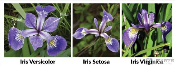
The Iris Dataset contains four features (length and width of sepals and petals) of 50 samples of three species of Iris (Iris setosa, Iris virginica and Iris versicolor). These measures were used to create a linear discriminant model to classify the species. The dataset is often used in data mining, classification and clustering examples and to test algorithms.
Information about the original paper and usages of the dataset can be found in the UCI Machine Learning Repository -- Iris Data Set.
Just for reference, here are pictures of the three flowers species:
实验内容介绍
下面我们按步骤来介绍实验的内容. 首先我们导入需要使用的库.
- import pandas as pd
- import numpy as np
- import matplotlib.pyplot as plt
- from sklearn.decomposition import PCA
- from sklearn.preprocessing import StandardScaler
- %matplotlib inline
导入数据集
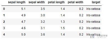
接着我们导入数据集, 使用iris的数据集.
- df = pd.read_csv('./iris.csv', names=['sepal length','sepal width','petal length','petal width','target'])
- df.head()
一共有4个特征, 共150个数据, 数据的简单描述如下所示, 数据集大小为150*5:
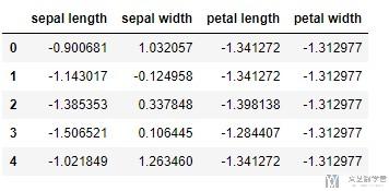
数据标准化
PCA is effected by scale so you need to scale the features in your data before applying PCA.(PCA会被数据的大小所影响, 所以在做之前, 我们需要先对数据进行标准化). 我们使用StandardScaler进行标准化, 标准化之后变为均值为0, 方差为1的数据.
- features = ['sepal length', 'sepal width', 'petal length', 'petal width']
- # Separating out the features
- x = df.loc[:, features].values
- # Separating out the target
- y = df.loc[:,['target']].values
- # Standardizing the features
- x = StandardScaler().fit_transform(x)
查看一下标准化之后的数据:
- # 查看标准化之后的数据
- pd.DataFrame(data = x, columns = features).head()
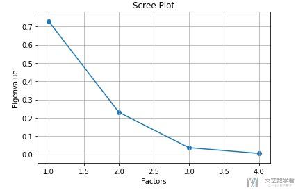
选择降维后的维数
接着我们看一下降维到多少维度比较合适, 我们看一下每一个变量方差的占比.
- pca = PCA(n_components=4)
- principalComponents = pca.fit_transform(x)
- pca.explained_variance_ratio_
- """
- array([0.72770452, 0.23030523, 0.03683832, 0.00515193])
- """
可以看到后面两个变量所占比例已经少于10%, 我们将其进行可视化, 可以更加直观.
- # 进行可视化
- importance = pca.explained_variance_ratio_
- plt.scatter(range(1,5),importance)
- plt.plot(range(1,5),importance)
- plt.title('Scree Plot')
- plt.xlabel('Factors')
- plt.ylabel('Eigenvalue')
- plt.grid()
- plt.show()
使用PCA降维
接下来我们使用PCA进行降维, 降到2维, 并查看降维后的结果,
- # 进行降维
- pca = PCA(n_components=2)
- principalComponents = pca.fit_transform(x)
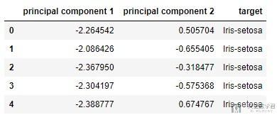
- # 查看降维后的数据
- principalDf = pd.DataFrame(data=principalComponents, columns=['principal component 1', 'principal component 2'])
- finalDf = pd.concat([principalDf, df[['target']]], axis = 1)
- finalDf.head(5)
查看转换系数
我们知道PCA中的新的变量是通过原始变量线性组合而来的, 我们下面看一下他们的系数, 看一下新的变量是否可以进行解释,
首先我们得到转换的系数.
- pca.components_
- """
- array([[ 0.52237162, -0.26335492, 0.58125401, 0.56561105],
- [ 0.37231836, 0.92555649, 0.02109478, 0.06541577]])
- """
接着我们来验证一下上面的系数是否正确, 我们就用这个系数来计算一下新的变量是否和实际的符合.

我们来使用数据来计算一下, 得到下面的值:
- (np.dot(x[0],pca.components_[0]), np.dot(x[0],pca.components_[1]))
- """
- (-2.2645417283949003, 0.5057039027737843)
- """
可以看到计算得到的值, 和上面表格中的值是一样的(表格中的第0行). 我们把系数进行可视化, 关于更多可视化的内容, 可以参考下面的链接: Seaborn绘图优化–矩阵可视化
可以更加容易看出新的变量与那些原始特征有关.
- # 对系数进行可视化
- import seaborn as sns
- df_cm = pd.DataFrame(np.abs(pca.components_), columns=df.columns[:-1])
- plt.figure(figsize = (12,6))
- ax = sns.heatmap(df_cm, annot=True, cmap="BuPu")
- # 设置y轴的字体的大小
- ax.yaxis.set_tick_params(labelsize=15)
- ax.xaxis.set_tick_params(labelsize=15)
- plt.title('PCA', fontsize='xx-large')
- # Set y-axis label
- plt.savefig('factorAnalysis.png', dpi=200)
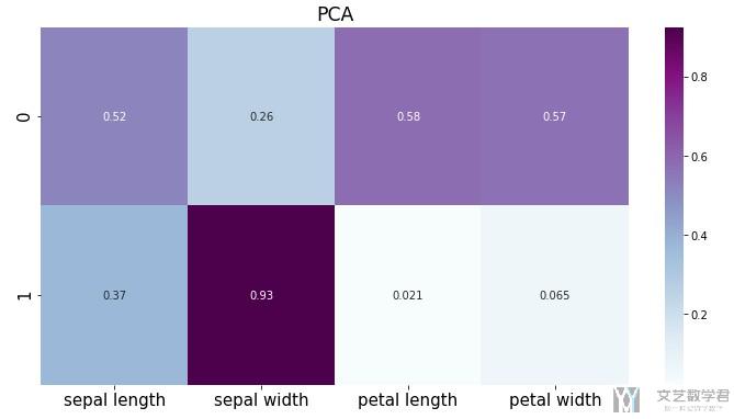
可以看到第二个变量与第二个原始特征的关系比较大, 第一个新变量与其余三个原始变量关系比较大.
数据降维可视化
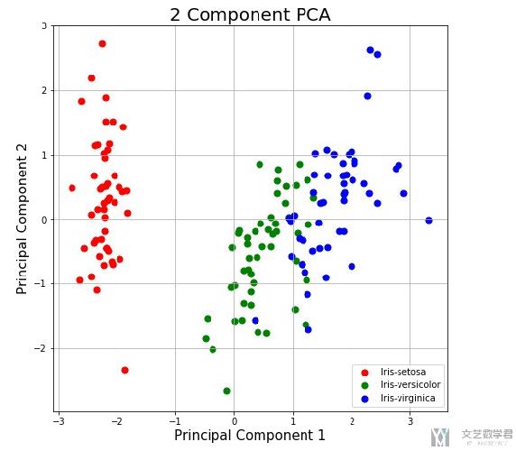
上面我们将数据降维到2维, 接着我们将其进行可视化, 可以更加清楚的进行展示.
- fig = plt.figure(figsize = (8,8))
- ax = fig.add_subplot(1,1,1)
- ax.set_xlabel('Principal Component 1', fontsize = 15)
- ax.set_ylabel('Principal Component 2', fontsize = 15)
- ax.set_title('2 Component PCA', fontsize = 20)
- targets = ['Iris-setosa', 'Iris-versicolor', 'Iris-virginica']
- colors = ['r', 'g', 'b']
- for target, color in zip(targets,colors):
- indicesToKeep = finalDf['target'] == target
- # 选择某个label下的数据进行绘制
- ax.scatter(finalDf.loc[indicesToKeep, 'principal component 1']
- , finalDf.loc[indicesToKeep, 'principal component 2']
- , c = color
- , s = 50)
- ax.legend(targets)
- ax.grid()
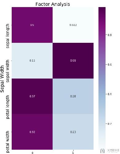
与因子分析(FA)比较
我们对上面同样的数据进行因子分析, 看一下因子分析的结果和主成分分析的结果的不同. 同一组数据下的比较可以更加直观展示出不同.
关于这一部分的代码就不放了, 和之前一篇将FA实战的代码基本是一样的, 我最后也会放上代码仓库的链接, 具体的可以在代码仓库中进行查看.
使用FA的系数矩阵如下所示, 可以看到每一个系数大小差都会变得更加大, 大的变得更大, 小的变得更小, 这样使得新的变量被解释起来会更加容易.
我们再来看一下降到2维后, 可视化之后的效果.
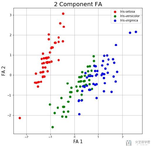
整体上来看, 总体的趋势是和使用PCA降维后可视化的效果是类似的.
项目代码
Github仓库Notebook: PCA(主成分分析)+FA(因子分析)
- 微信公众号
- 关注微信公众号
-

- QQ群
- 我们的QQ群号
-


2019年9月14日 下午9:16 1F
这个for循环是什么意思呢?
我尝试了你的方法,没有报错,但数据没有在图上显示出来,我想可能是这个for循环我没理解。
2019年9月15日 上午10:46 B1
@ 子夜 这是对每一类的样本绘制不同的颜色. 前面定义了targets和color, 我们找出对应的target的index, 接着设置不同的颜色. 这里的for循环就是对不同的种类分别进行绘制不同的颜色.