文章目录(Table of Contents)
简介
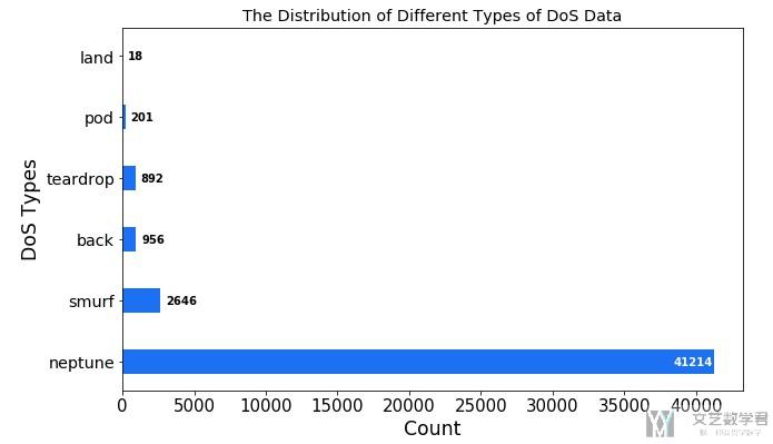
这一部分介绍一下使用matplotlib绘制柱状图(bar)的时候, 显示每个柱状上面的个数是多少。方便进行更加详细的展示。
参考资料
下面代码主要根据官方的资料修改而来,参考链接如下:
Percentiles as horizontal bar chart
代码实践
直接贴一下代码,添加文字的部分是在for循环那里开始的,具体可以看一下实现的流程.
- x_name = ['neptune', 'smurf', 'back', 'teardrop', 'pod', 'land'] # 柱状图横坐标的名字
- x_value = [41214, 2646, 956, 892, 201, 18] # 柱状图的值
- x = np.arange(len(x_name))*2
- fig, ax1 = plt.subplots()
- fig.set_size_inches(10, 6)
- # 绘制多个bar在同一个图中, 这里需要控制width
- rects = plt.barh(x, x_value, color='#1b71f1', align='center')
- # 设置坐标轴的标签
- ax1.xaxis.set_tick_params(labelsize=15) # 设置y轴的字体的大小
- ax1.set_yticks(x) # 设置xticks出现的位置
- ax1.set_yticklabels(x_name, fontsize = 'x-large') # 设置xticks的值
- # 设置坐标轴的范围
- # ax1.set_ylim(0,15000) # 设置x轴的范围
- # 设置坐标轴名称
- ax1.set_xlabel("Count", fontsize='xx-large')
- ax1.set_ylabel("DoS Types", fontsize='xx-large')
- # 设置标题
- ax1.set_title('The Distribution of Different Types of DoS Data', fontsize='x-large')
- # --------------------
- # 下面开始添加文字说明
- # --------------------
- rect_labels = []
- # Lastly, write in the ranking inside each bar to aid in interpretation
- for rect in rects:
- # Rectangle widths are already integer-valued but are floating
- # type, so it helps to remove the trailing decimal point and 0 by
- # converting width to int type
- width = int(rect.get_width())
- rankStr = width
- # The bars aren't wide enough to print the ranking inside
- if width < 4000: # 这个值用来判断count的值出现在左侧还是右侧
- # Shift the text to the right side of the right edge
- xloc = 5
- # Black against white background
- clr = 'black'
- align = 'left'
- else:
- # Shift the text to the left side of the right edge
- xloc = -1
- # White on magenta
- clr = 'white'
- align = 'right'
- # Center the text vertically in the bar
- yloc = rect.get_y() + rect.get_height() / 2
- label = ax1.annotate(rankStr, xy=(width, yloc), xytext=(xloc, 0),
- textcoords="offset points",
- ha=align, va='center',
- color=clr, weight='bold', clip_on=True)
- rect_labels.append(label)
- plt.show()
最终的实验效果如下所示:
- 微信公众号
- 关注微信公众号
-

- QQ群
- 我们的QQ群号
-


评论