文章目录(Table of Contents)
简介
这一部分会介绍关于ROC(Receiver Operating Characteristic)曲线和AUC值得计算。
参考资料
sklearn计算绘图代码例子(我自己主要就是参考得这个链接) : Receiver Operating Characteristic (ROC)
ROC原理讲解 : Introduction to ROC Curves
公式的来源 : Understanding AUC - ROC Curve
ROC介绍
ROC curves typically feature true positive rate on the Y axis, and false positive rate on the X axis. This means that the top left corner of the plot is the "ideal" point - a false positive rate of zero, and a true positive rate of one. This is not very realistic, but it does mean that a larger area under the curve (AUC) is usually better.
The "steepness" of ROC curves is also important, since it is ideal to maximize the true positive rate while minimizing the false positive rate.
ROC名字来源
You may be wondering where the name "Reciever Operating Characteristic" came from. ROC analysis is part of a field called "Signal Dectection Theory" developed during World War II for the analysis of radar images.
Radar operators had to decide whether a blip on the screen represented an enemy target, a friendly ship, or just noise. Signal detection theory measures the ability of radar receiver operators to make these important distinctions. Their ability to do so was called the Receiver Operating Characteristics. It was not until the 1970's that signal detection theory was recognized as useful for interpreting medical test results.
ROC曲线的绘制与AUC的计算--例子
这里我们会通过一个例子来讲解一下ROC曲线是如何绘制出来的。
整体解释
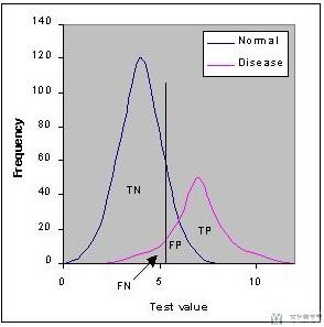
下图表示Normal与Disease两类人群的分布, 其中蓝色的分布表示Normal, 紫色的分布表示Disease. 这两部分有重叠的部分,这表示我们是无法100%全部划分正确的。
我们通常会取一个阈值,下图的黑色直线。我们使值大于黑线(在黑色线右侧)为Disease,在黑色线左侧表示Nomal.
阈值的选择会导致产生不同的TN, FN, FP, TP。我们可以选择不同的阈值来来使得某个错误最小来满足特定场景的需求。
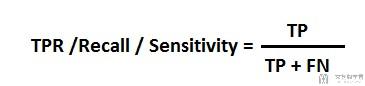
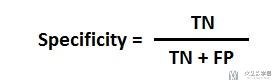
预备知识
我们首先说明两个计算式子,后面会用到。
TPR (True Positive Rate) / Recall /Sensitivity
Specificity
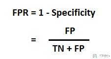
FPR
ROC曲线的绘制(具体的算例)
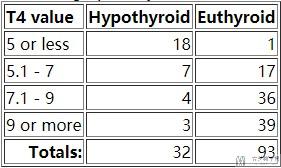
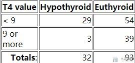
这里我们选取甲状腺功能异常(Hypothyroid)和甲状腺功能正常(Euthyroid)的数据与T4 Value的关系,数据的分布如下所示:
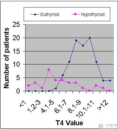
我们以图像的形式进行最后的展示。
我们可以调整T4 Value(分类的阈值)的值,来获得不同的分类的结果。关于这一副图, 文章快手数据类笔试B笔经新鲜出炉。ROC曲线和AUC值也是给出了很详细的解释, 可以参考一下.
情况一 : 例如我们假设T4 Value<5的时候, 认为是甲状腺功能异常(Hypothyroid),则最后会获得下面的混淆矩阵:
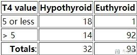
我们计算得到Sensivity(Recall/TPR/True Positive Rate) is 18/32=0.56 and the Specificity is 92/93=0.99
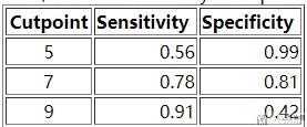
情况二 : 例如我们假设T4 Value<7的时候, 认为是甲状腺功能异常(Hypothyroid),则最后会获得下面的混淆矩阵:
我们计算得到Sensivity(Recall/TPR/True Positive Rate) is 0.78(有更高的召回率) and the Specificity is 0.81.
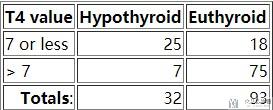
情况三 : 例如我们假设T4 Value<9的时候, 认为是甲状腺功能异常(Hypothyroid),则最后会获得下面的混淆矩阵:
我们计算得到Sensivity(Recall/TPR/True Positive Rate) is 0.91(有更高的召回率) and the Specificity is 0.42(代价就是会有更多normal被判断为disease).
我们把上面三种情况的Sensivity(Recall/TPR/True Positive Rate)和Specificity绘制在一起。
对于这张表格,我们可以进行小的变化(FPR=1-Specificity),转换为下面的内容。
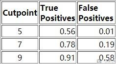
我们将表格中的TPR作为纵坐标, FPR作为横坐标,绘制出如下的图像,该图像被称为Receiver Operating Characteristic curve (or ROC curve.)
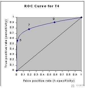
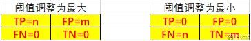
这副图像的横纵坐标是通过调整不同的阈值,计算出TPR与FPR得到的。对于坐标(1,1)和坐标(0,0)我们可以理解为:
- 当阈值T4 Value我们调整为最大的时候,这个时候就是全部预测为甲状腺功能异常(Hypothyroid),此时的TPR=FPR=1;
- 当阈值T4 Value我们调整为最小的时候,这个时候就是全部预测为甲状腺功能正常(Euthyroid),此时的TPR=FPR=0;
上面的两种情况的TP, FP, FN, TN的值分别如下。
我们也可以通过下面的图进行理解,如果正负样本是完全分离的,那么ROC曲线绘制出来就是两条直线的拼接,如下图所示:
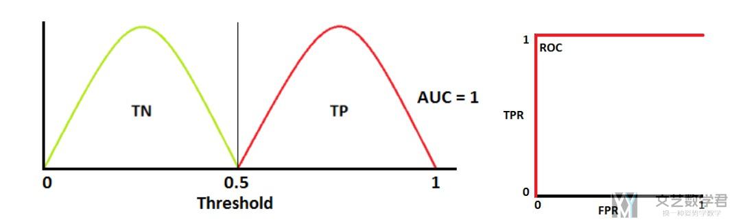
当阈值(Threshold)调整的很大的时候,此时TPR=FPR=1。当阈值逐渐减小,我们希望我们的模型TPR=1, 但是FPR可以下降。当到了临界点的时候,此时FPR的值保持不变,TPR的值逐渐下降。
AUC值的计算(具体算例)
上面我们绘制得到了ROC曲线,下面我们介绍一下AUC值的计算。
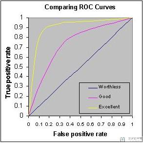
Accuracy is measured by the area under the ROC curve. AUC的值就是ROC曲线的下半部分。
我们可以将AUC值理解为区分度,即区分模型对于正常样本与异常样本的区分度。AUC值越大越好。如下面的图中,三种颜色分别对应worthless, good, excellent.
ROC曲线绘制与AUC值计算(代码介绍)
这一部分我们看一下实际在使用的时候,我们是如何来绘制ROC曲线的.
一个例子(官方样例)
这个例子就是上面参考资料里给出的例子, 我下面贴的代码基本是和他给的是一样的, 我只是在部分地方加了一些注释, 方便我自己的理解. 他这个例子给了一个很好的示范, 如何绘制多分类的ROC曲线和计算AUC值.
我会再把官方的代码重新拆分一下,方便理解。
模型的训练
这是第一部分, 首先是进行模型的训练和进行预测, 得到预测的值y_score.
- import numpy as np
- import matplotlib.pyplot as plt
- from itertools import cycle
- from sklearn import svm, datasets
- from sklearn.metrics import roc_curve, auc
- from sklearn.model_selection import train_test_split
- from sklearn.preprocessing import label_binarize
- from sklearn.multiclass import OneVsRestClassifier
- from scipy import interp
- # Import some data to play with
- iris = datasets.load_iris()
- X = iris.data
- y = iris.target
- # Binarize the output
- y = label_binarize(y, classes=[0, 1, 2])
- n_classes = y.shape[1]
- # Add noisy features to make the problem harder
- random_state = np.random.RandomState(0)
- n_samples, n_features = X.shape
- X = np.c_[X, random_state.randn(n_samples, 200 * n_features)]
- # shuffle and split training and test sets
- X_train, X_test, y_train, y_test = train_test_split(X, y, test_size=.5,
- random_state=0)
- # Learn to predict each class against the other
- classifier = OneVsRestClassifier(svm.SVC(kernel='linear', probability=True,
- random_state=random_state))
- y_score = classifier.fit(X_train, y_train).decision_function(X_test)
计算每一个AUC值(包括micro和macro)
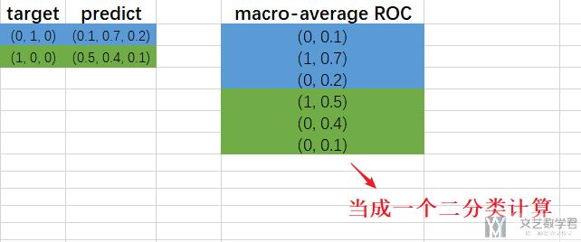
我们可以把一个多分类想象成很多个二分类, 其实将label写成one-hot形式就可以理解。
比如现在有4类, 那么label=3会写成(0,0,1,0), 这样相当于是四个二分类的正确答案, 这样对于一个多分类问题就可以求解他的AUC值和绘制ROC曲线了。
下面的代码先是求出每一个二分类的值,接着求出micro-average ROC(这个相当于是把所有的分类全部展开重新计算ROC, 看成一个大的二分类的结果)
- # Compute ROC curve and ROC area for each class
- fpr = dict()
- tpr = dict()
- roc_auc = dict()
- for i in range(n_classes):
- fpr[i], tpr[i], _ = roc_curve(y_test[:, i], y_score[:, i])
- roc_auc[i] = auc(fpr[i], tpr[i])
- # 这个AUC值
- print(roc_auc)
- # Compute micro-average ROC curve and ROC area
- fpr["micro"], tpr["micro"], _ = roc_curve(y_test.ravel(), y_score.ravel()) # 这个是ROC曲线的坐标
- roc_auc["micro"] = auc(fpr["micro"], tpr["micro"]) # 这个是计算AUC的值
- print(roc_auc)
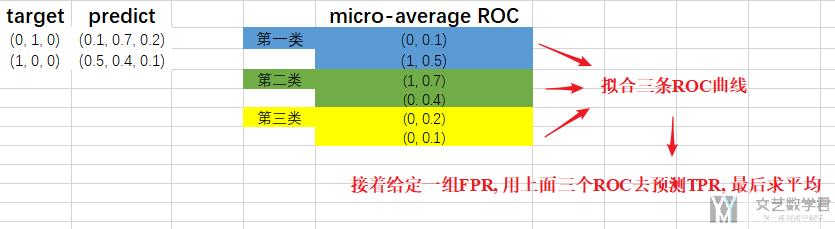
接着我们计算macro-average ROC(对于macro-average ROC, 我们举一个例子, 比如是三分类的情况, 这个时候会对每一个分类的情况都绘制ROC曲线, 现在我们要计算平均值, 那么我们就对这三条曲线进行拟合, 接着给定一组FPR去预测TPR, 也就是可以得到三组TPR值, 最后对这三组求和, 最后就得到了FPR对应的TPR), 具体的计算方式如下。
- # Compute macro-average ROC curve and ROC area
- # First aggregate all false positive rates
- all_fpr = np.unique(np.concatenate([fpr[i] for i in range(n_classes)]))
- # Then interpolate all ROC curves at this points
- mean_tpr = np.zeros_like(all_fpr)
- for i in range(n_classes):
- mean_tpr += interp(all_fpr, fpr[i], tpr[i])
- # Finally average it and compute AUC
- mean_tpr /= n_classes
- fpr["macro"] = all_fpr
- tpr["macro"] = mean_tpr
- roc_auc["macro"] = auc(fpr["macro"], tpr["macro"])
我们再重新总结一下上面的macro-average ROC和micro-average ROC(感谢郭鑫宇在下面的回复, 我在这里进一步补充). 出现这两个求平均的方式是因为在多分类的问题中, 我们无法求出一个AUC值, 而是对每一类进行求. 于是我们需要一种平均的方式来对整个模型的好坏给出评价, 于是出现了这两种平均的方式.
首先是micro-average ROC(下面图里写错了)的计算.
接着是macro-average ROC(下面图里写错了)的计算
绘制ROC曲线和计算AUC值
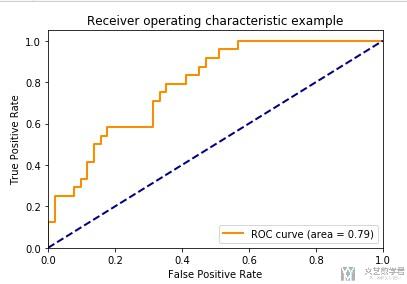
最后就是我们的绘图的阶段了,我们先单独绘制一个ROC曲线。
- plt.figure()
- lw = 2 # linewidth(线条的粗细)
- plt.plot(fpr[2], tpr[2], color='darkorange',
- lw=lw, label='ROC curve (area = %0.2f)' % roc_auc[2])
- plt.plot([0, 1], [0, 1], color='navy', lw=lw, linestyle='--') # 这是绘制中间的直线
- plt.xlim([0.0, 1.0])
- plt.ylim([0.0, 1.05])
- plt.xlabel('False Positive Rate')
- plt.ylabel('True Positive Rate')
- plt.title('Receiver operating characteristic example')
- plt.legend(loc="lower right")
- plt.show()
最终的效果如下所示:
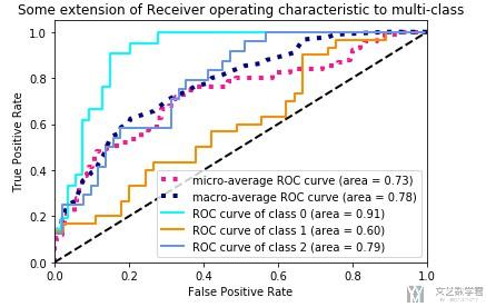
最后,我们把所有的ROC曲线绘制在一起。
- # Plot all ROC curves
- plt.figure()
- plt.plot(fpr["micro"], tpr["micro"],
- label='micro-average ROC curve (area = {0:0.2f})'
- ''.format(roc_auc["micro"]),
- color='deeppink', linestyle=':', linewidth=4)
- plt.plot(fpr["macro"], tpr["macro"],
- label='macro-average ROC curve (area = {0:0.2f})'
- ''.format(roc_auc["macro"]),
- color='navy', linestyle=':', linewidth=4)
- colors = cycle(['aqua', 'darkorange', 'cornflowerblue'])
- for i, color in zip(range(n_classes), colors):
- plt.plot(fpr[i], tpr[i], color=color, lw=lw,
- label='ROC curve of class {0} (area = {1:0.2f})'
- ''.format(i, roc_auc[i]))
- plt.plot([0, 1], [0, 1], 'k--', lw=lw)
- plt.xlim([0.0, 1.0])
- plt.ylim([0.0, 1.05])
- plt.xlabel('False Positive Rate')
- plt.ylabel('True Positive Rate')
- plt.title('Some extension of Receiver operating characteristic to multi-class')
- plt.legend(loc="lower right")
- plt.show()
最终的效果如下所示:
- 微信公众号
- 关注微信公众号
-

- QQ群
- 我们的QQ群号
-


2020年4月13日 上午1:37 1F
作者您好,我想问一下,单独画出来的ROC曲线有什么重要意义吗? 还想再问一下,您已经说了微观平均ROC的意义,但宏观平均ROC的意义还没说呢。嘻嘻,求教啦。
我部分引用了您的文章。感谢您。
https://www.cnblogs.com/guoxinyu/p/12687484.html
2020年4月13日 上午8:55 B1
@ 郭鑫宇 你好, 感谢你的评论. 我已经在原文中进行了更进一步的说明, 你可以重新读一下那部分, 我增加了文字和图片的介绍.
2020年4月13日 上午11:29 2F
嘻嘻 作者您好。我更新了自己的文章。不过感觉您的微观宏观的叙述,和新作的Excel图好像颠倒了嘿。
点击我的昵称即可进入原文
2020年4月13日 下午9:07 B1
@ 郭鑫宇 是的, Excel图写反了, 我在文章里做一下文字说明, 图片就不改了. 谢谢啦.