文章目录(Table of Contents)
简介
这一篇是关于对Coronavirus数据的一些简单分析. 这里会包括数据处理, 简单的数据可视化和简单的预测, 寻找变量与变量之间的关系. 我们下面在介绍的时候, 就会分成这三个部分一一进行介绍.
这个其实是我的一个大作业, 在这里也是记录一下我做大作业的一个步骤, 也是记录一下如何使用Plotly来进行可视化的展示.
相关的链接
- 关于绘制动态图的教程: Plotly之高级使用说明
- 关于课程的相关说明: University of Agder交换记录–Data Science Applications(课程)
- 关于课程作业的相关说明: University of Agder交换记录–Data Science Applications(作业)
- 所有代码已上传kaggle主页(下面的动图可以在该主页进行查看), Data analysis on Coronavirus
- 最后的文档, 可以查看github链接, data science作业内容.
数据集介绍
这一部分的内容和上面的关于课程作业的相关说明链接里的内容是一样的, 我自这里重新说明一下, 为了方便后面的介绍.
Coronavirus的数据集
首先关于Coronavirus的数据集来自github, COVID-19 Data Repository by the Center for Systems Science and Engineering (CSSE) at Johns Hopkins University
在这个仓库里面, 他会更新每一天的, 每一个国家的Coronavirus的确诊人数, 死亡人数和恢复人数. 也就是会有三张表格, 分别记录confirmed, death和recovered.
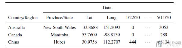
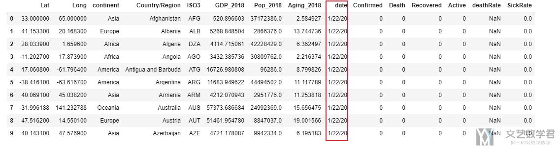
我们看一下数据的样例, 可以看到数据包括国家名称, 省或州的名字, 精度和纬度, 和每一天的人数(confirmed, death, recovered):
GDP, Population和Aging数据集
因为我们想要分析人数与国家发展, 国家人口和老龄化之间的关系, 所以我们还用到了另外三个数据集, 链接如下:
- GDP dataset (每个国家的GDP数据), https://data.worldbank.org/indicator/NY.GDP.PCAP.CD?locations=MC&name_desc=false
- Population dataset (每个国家的人口数据), https://data.worldbank.org/indicator/sp.pop.totl?end=2018&start=2018
- Aging dataset (每个国家的人口老龄化数据), https://data.worldbank.org/indicator/SP.POP.65UP.TO.ZS?end=2018&locations=LK&most_recent_value_desc=true&start=2018&view=map&year=2018
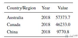
这些数据的格式基本都是一样的, 我们就看一下每个国家的人均GDP的数据的数据样例.
数据处理
合并各省(州)数据
因为我们之后是对整个国家进行分析, 但是在原始数据集中细分到了省和州的数据, 所以我们需要首先对他们进行合并.
我们使用group_by对数据进行合并, 同时对不同的变量采用不同的操作. 对每一天的人数, 我们将其求和, 也就是对一个国家不同省的人数求和, 得到那个国家当天的数据. 对经度和纬度我们求平均.
首先我们建立一个字典, 为index名称对应执行的操作.
- dict_groupby = {i:'sum' for i in confirm.columns.values[4:]}
- dict_groupby['Lat'] = 'mean'
- dict_groupby['Long'] = 'mean'
- dict_groupby
例如, 在这里建立的字典最终的结果大致如下.
- {...
- '5/9/20': 'sum',
- '5/10/20': 'sum',
- '5/11/20': 'sum',
- 'Lat': 'mean',
- 'Long': 'mean'}
接着, 我们对每一个table应用上面的dict即可.
- # confirmed cases
- confirmCountry = confirm.groupby('Country/Region').agg(dict_groupby)
- # confirmCountry.drop('Cruise Ship', inplace=True)
- confirmCountry.head()
上面就完成了对confirmed这个表格数据各省的合并.
生成活跃人数数据集
原始的数据只包含三个最基本的数据集, 也就是确诊人数, 死亡人数和恢复人数. 我们在这里新建一个表, 表示活跃人数, 也就是仍在患病状态的人.
我们记他们为active people, 计算方式为: active=confirmed-death-recovery.
- # add active case: confirm-death-recovery
- activeCountry = (confirmCountry - deathCountry - recoveredCountry)
- activeCountry['Lat'] = -activeCountry.loc[:,'Lat'].values
- activeCountry['Long'] = -activeCountry.loc[:,'Long'].values
- activeCountry.head()
注意对于经度和纬度需要额外处理一下.
新增变量-大洲与ISO3
最后为了可以关联其他变量进行进行分析, 我们在表格中增加新的变量. 也就是与其他的数据集进行融合.
首先我们增加每一个国家所属大洲的信息, 这个信息需要使用python库country_converter, 我们在最开始进行了导入.
- import country_converter as coco
就是就是对table的中国家名称进行转换, 转换为所属大洲并在原始表格中新加一列数据.
- # add continent
- continent_name = coco.convert(names = list(confirmCountry.index.values), to='continent')
- # 对每一个表格进行增加
- confirmCountry['continent'] = continent_name
- deathCountry['continent'] = continent_name
- recoveredCountry['continent'] = continent_name
- activeCountry['continent'] = continent_name
结果如下图所示, 可以看到新增了continent的内容.
但是我们看到国家名称是在index处的, 于是我们新加一列, 表示国家名称.
- # add country name
- country_name = confirmCountry.index.values
- # 对每一个table进行增加国家名称
- confirmCountry['Country/Region'] = country_name
- deathCountry['Country/Region'] = country_name
- recoveredCountry['Country/Region'] = country_name
- activeCountry['Country/Region'] = country_name
接着我们新增每个国家的ISO3短代码, 这是由于在国家名称书写的时候, 可能会存在不一样的情况, 但是每一个国家的ISO3都是确定的. 这也方便了我们之后与其他数据集的合并.
- # add country code
- confirmCountry['ISO3'] = confirmCountry.apply(lambda x : coco.convert(x['Country/Region'], to='ISO3', not_found=None), axis=1)
- deathCountry['ISO3'] = deathCountry.apply(lambda x : coco.convert(x['Country/Region'], to='ISO3', not_found=None), axis=1)
- recoveredCountry['ISO3'] = recoveredCountry.apply(lambda x : coco.convert(x['Country/Region'], to='ISO3', not_found=None), axis=1)
- activeCountry['ISO3'] = activeCountry.apply(lambda x : coco.convert(x['Country/Region'], to='ISO3', not_found=None), axis=1)
数据合并-GPD,Aging,Population
有了上面的ISO3代码之后, 我们就可以与其他数据集进行合并了. 使用到的三个数据集在上面已经进行了介绍, 包括每个国家的人均GDP数据, 每个国家的人口老龄化数据和每个国家的人口数据.
首先我们合并GDP数据, 我们先从数据集中读取数据并保存在一个新的dataframe里面(原始的里面包含每一年的数据, 在这里我们只需要使用最新一年的数据即可).
- # --------------------
- # combine with GDP
- # --------------------
- GDP_data = pd.read_csv('/kaggle/input/coronavirus-analysis/GDP/GDP.csv')
- # -------------------
- # create new table
- # ------------------
- GDP_2018 = GDP_data.loc[:,['Country Code', '2018']] # 选取需要的字段
- GDP_2018.rename(columns={'Country Code':'ISO3', '2018':'GDP_2018'}, inplace=True) # 重命名
- GDP_2018.dropna(subset=['GDP_2018'], inplace=True) # 去除空值
- # --------------
- # start merge
- # -------------
- confirmCountry = pd.merge(confirmCountry, GDP_2018, on=['ISO3'])
- deathCountry = pd.merge(deathCountry, GDP_2018, on=['ISO3'])
- recoveredCountry = pd.merge(recoveredCountry, GDP_2018, on=['ISO3'])
- activeCountry = pd.merge(activeCountry, GDP_2018, on=['ISO3'])
其他的合并也是和上面的类似, 我们就不重复进行说明了. 最终, 我们对每一个表格增加了以下的新的变量,
- 所属大洲, ISO3
- 这个国家的人均GDP
- 这个国家的老龄化情况这个国家的人口情况.
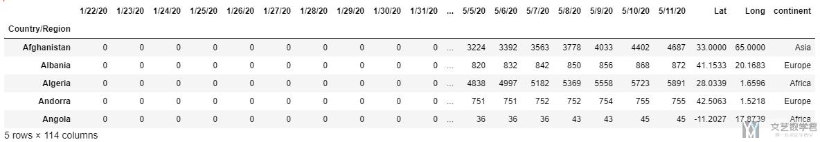
最后的表格如下所示.
到这里就完成了基本的数据处理, 下面是基本数据可视化的内容.
数据格式的转换
接着我们对上面的数据进行处理, 将段表变为长表格, 这个部分可以查看链接, Melt-dataframe变形. 这种处理的数据是会在动图显示的时候有用到, 其他的分析还是使用上面的数据.
首先对上面四张表的内容各自进行转换, 将其转换为长表.
- # 1. confirmed cases
- animationCountry = confirmCountry.copycopy()
- animationCountry.reset_index(drop=True, inplace=True)
- pd1 = pd.melt(animationCountry, id_vars=['Lat', 'Long', 'continent', 'Country/Region', 'ISO3', 'GDP_2018', 'Pop_2018', 'Aging_2018'], var_name = 'date', value_name='Confirmed')
- # 2. death cases
- animationCountry = deathCountry.copycopy()
- animationCountry.reset_index(drop=True, inplace=True)
- pd2 = pd.melt(animationCountry, id_vars=['Lat', 'Long', 'continent', 'Country/Region', 'ISO3', 'GDP_2018', 'Pop_2018', 'Aging_2018'], var_name = 'date', value_name='Death')
- # 3. recovered cases
- animationCountry = recoveredCountry.copycopy()
- animationCountry.reset_index(drop=True, inplace=True)
- pd3 = pd.melt(animationCountry, id_vars=['Lat', 'Long', 'continent', 'Country/Region', 'ISO3', 'GDP_2018', 'Pop_2018', 'Aging_2018'], var_name = 'date', value_name='Recovered')
- # 4. active cases
- animationCountry = activeCountry.copycopy()
- animationCountry.reset_index(drop=True, inplace=True)
- pd4 = pd.melt(animationCountry, id_vars=['Lat', 'Long', 'continent', 'Country/Region', 'ISO3', 'GDP_2018', 'Pop_2018', 'Aging_2018'], var_name = 'date', value_name='Active')
接着对上面的四个表进行merge, 这里会用到一个知识点, 多个表的merge, 具体的说明可以查看链接, 多个dataframe的merge. 在这里, 也就是下面的代码.
- # product new dataset
- data_frames = [pd1, pd2, pd3, pd4]
- df_merged = functools.reduce(lambda left, right: pd.merge(left, right,on=['Lat', 'Long', 'continent', 'Country/Region', 'ISO3', 'GDP_2018', 'Pop_2018', 'Aging_2018', 'date']), data_frames)
接着我们增加两个变量备用, 分别是致死率(death Rate)和患病率(Sick Rate). 增加这两个变量是因为我们希望考虑患病人数的时候, 可以考虑这个国家的总人数. 很明显, 如果一个国家的人口越多, 那么得病的人也就会越多.
- # add two new variables
- df_merged['deathRate'] = df_merged['Death']/df_merged['Confirmed']
- df_merged['SickRate'] = df_merged['Confirmed']/df_merged['Pop_2018']
- df_merged.head()
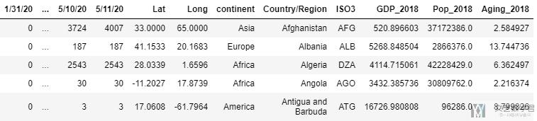
最终处理好的数据如下所示, 就全部按照时间进行展开了:
关于Coronavirus数据的基础数据可视化
这一部分的目的就是为了我们更好的了解数据. 使用可视化的方式, 帮助我们对数据有更加深刻的理解.
分析总体的变化趋势
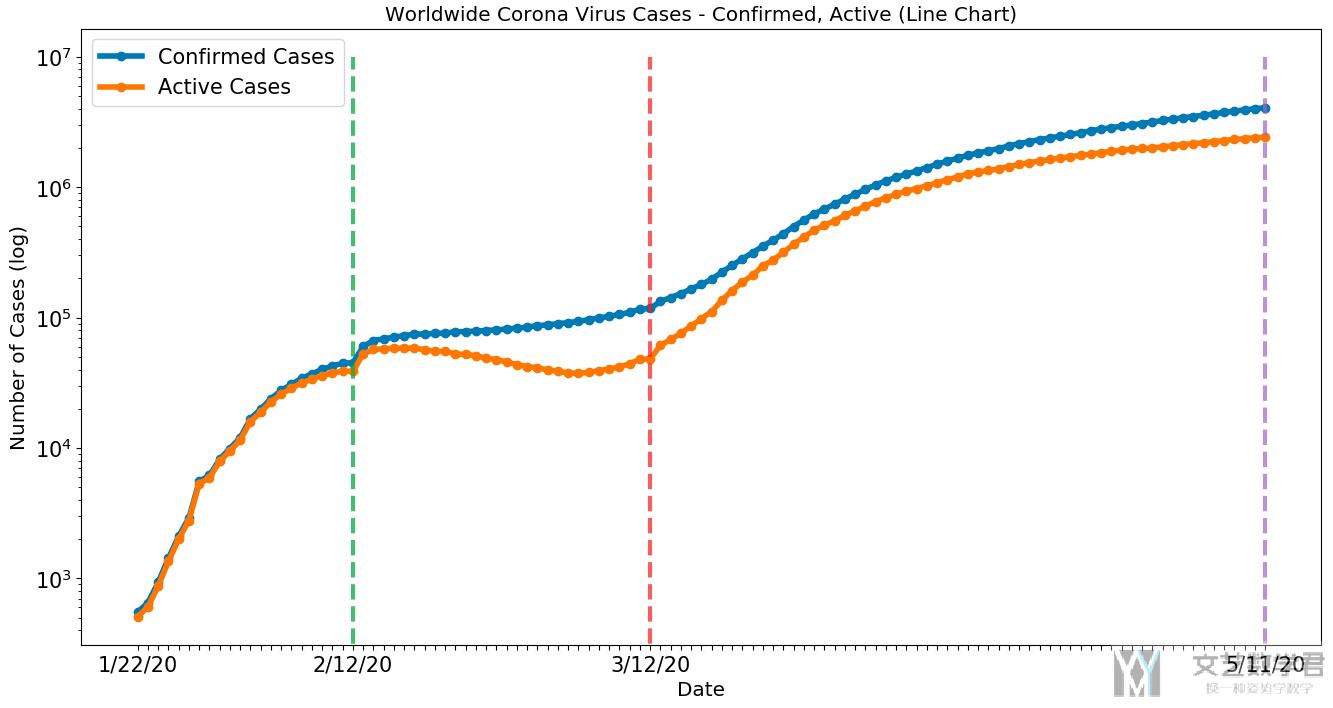
首先我们绘制全球的总体的变化趋势, 即每一天活跃人数和确诊人数的变化. 在这里y轴我们使用了log scale, 这是因为后期的数字上升实在是太快了, 为了更好地看出趋势, 我们在这里使用了log scale.
- matplotlib.style.use('default')
- # Start
- fig, ax1 = plt.subplots()
- fig.set_size_inches(16, 8)
- plt.set_cmap('RdBu')
- # plt.xkcd()
- # multiple line plot
- pos = np.where(confirmCountry.columns.values==latest_date)[0][0]+1 # 找出想画图画到的日期
- x = confirmCountry.columns.values[:pos]
- lw = 4
- a, = ax1.plot(x, confirmCountry.sum().values[:pos], linewidth=lw, label='Confirmed Cases', marker='o') # confirm
- b, = ax1.plot(x, activeCountry.sum().values[:pos], linewidth=lw, label='Active Cases', marker='o') # active
- plt.legend(handles = [a,b], fontsize=15)
- # add Vertical line
- ax1.plot(['2/12/20', '2/12/20'], [0, 10000000], lw=3, linestyle='--', alpha=0.7)
- ax1.plot(['3/12/20', '3/12/20'], [0, 10000000], lw=3, linestyle='--', alpha=0.7)
- ax1.plot([latest_date, latest_date], [0, 10000000], lw=3, linestyle='--', alpha=0.7)
- ax1.yaxis.set_tick_params(labelsize=15)
- # ax1.set_xticks(x)
- xticks = [i if i in ['1/22/20' ,'2/12/20', '3/12/20', latest_date] else '' for i in x] # x轴几个标记点
- ax1.set_xticklabels(xticks, rotation=0, fontsize=15) # x轴设置trick
- ax1.set_ylabel("Number of Cases (log)", fontsize='x-large')
- ax1.set_xlabel('Date', fontsize='x-large')
- ax1.set_title('Worldwide Corona Virus Cases - Confirmed, Active (Line Chart)', fontsize='x-large')
- plt.yscale('log')
- # plt.ylabel('logy')
- plt.show()
绘制出来的结果如下所示, 可以看到:
- 从1/22到2/12这段时间, active cases增长迅速
- 从2/12到3/12号这段时间, active cases出现了缓慢的下降.
- 但是从3/12开始, 这个数字又开始了快速的上升.
对各个大洲进行分析
上面是全球的数据, 我们现在来分析一下各个大洲的数据的变化趋势, 我们这里以active cases作为例子, 其他的图都是类似的.
- plotCountry = activeCountry.groupby('continent').sum()
- plotCountry.drop(['Lat', 'Long', 'GDP_2018', 'Pop_2018', 'Aging_2018'], axis=1, inplace=True)
- plotCountry['continent'] = plotCountry.index.values
- matplotlib.style.use('default')
- fig, ax1 = plt.subplots()
- fig.set_size_inches(16, 8)
- plt.set_cmap('RdBu')
- x = plotCountry.columns.values[:-1] # 设置日期
- lw = 2
- for name in plotCountry.index.values:
- ax1.plot(x, plotCountry.loc[name].values[:-1], linewidth=lw, label=name, marker='o', markersize=2.5) # confirm
- plt.legend(plotCountry.loc[:,'continent'])
- ax1.plot(['2/12/20', '2/12/20'], [0, 1000000], lw=3, linestyle='--', alpha=0.7)
- ax1.plot(['3/12/20', '3/12/20'], [0, 1000000], lw=3, linestyle='--', alpha=0.7)
- ax1.plot([latest_date, latest_date], [0, 1000000], lw=3, linestyle='--', alpha=0.7)
- ax1.yaxis.set_tick_params(labelsize=15)
- # ax1.set_xticks(x)
- xticks = [i if i in ['1/22/20', '2/12/20', '3/12/20', latest_date] else '' for i in x]
- ax1.set_xticklabels(xticks, rotation=0, fontsize=15)
- ax1.set_ylabel("Number of Cases (log)", fontsize='x-large')
- ax1.set_xlabel('Date', fontsize='x-large')
- ax1.set_title('Active Corona Virus Cases in Each Continent - (Line Chart)', fontsize='x-large')
- # set y scale
- plt.yscale('log')
- plt.show()
最终的结果如下图所示:
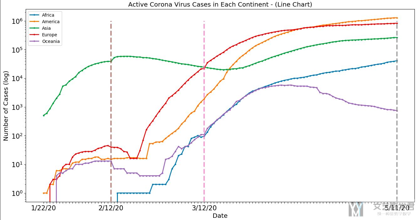
可以看到:
- 绿色的曲线表示亚洲, 一开始亚洲开始上升, 2/12号到达高点之后感染人数开始下降.
- 欧洲, 美洲人数从2/12开始上升, 并且上升势头强劲.
- 亚洲在3/12之后感染人数又开始上升.
我们后面在从国家层面分析的时候会解释上面现象出现的原因. 注意这里y轴都是log scale.
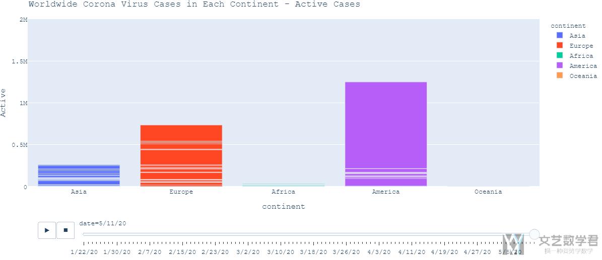
关于大洲人数的变化曲线, 我们也可以使用柱状图来表示, 同时做成动态图的形式, 清晰的展现出每个大洲每一天的人数的变化过程. 我们截取其中的一天的结果如下图所示, 这是2020年5月11日每个大洲的active cases的柱状图.
完整的动态图还是从最上面kaggle的主页点击进去查看.
对于各个国家的分析
我们分析一下出现上面情况的原因, 我们从每一个国家的数据入手进行查看. 我们会查看每一个国家的confirmed case的变化以及每一个国家的active cases的变化趋势. 这里我们还是以active cases作为示例进行解释.
这里绘图的代码也和上面的相似, 就不在这里重复了, 我们直接看结果 (在结果显示的时候, 我们只显示了人数超过某个特定阈值的国家的情况, 不然把所有的国家都进行可视化会看不清最后的结果).
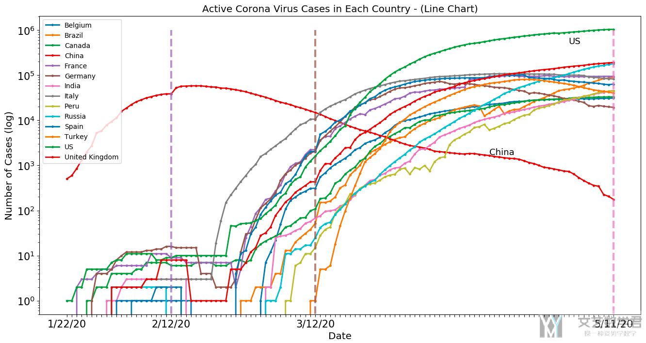
通过结果, 我们可以解释一下上面各大洲的变化趋势.
- 一开始, 从亚洲的中国开始, 感染人数迅速上升, 并在2/12号到达顶点
- 接着从2/12号开始, 欧洲和美洲的国家感染人数开始快速上升, 特别是美国, 可以看到目前感染人数是最多的.
- 同时, 从3/12号开始, 亚洲其他国家, 例如印度和土耳其, 感染人数也在上升, 导致上面按大洲分析的时候后期亚洲的感染人数再次上升.
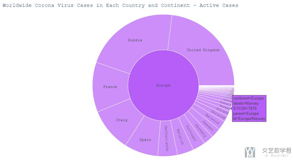
使用Sunburst Chart显示更多细节
为了更好的显示大洲与国家之间的关系, 我们还绘制了Sunburst Chart, 且可以进行交互. 我们还是使用active case作为例子. 我们只绘制最后一天的数据.
- # plot the active case in world wide
- fig = px.sunburst(activeCountry, path=['continent', 'Country/Region'], values=latest_date,
- color='continent',
- color_continuous_scale='OrRd')
- fig.update_layout(title='Worldwide Corona Virus Cases in Each Country and Continent - Active Cases',
- font=dict(family="Courier New, monospace",
- size=13)
- )
- fig.update_layout(margin={"r":0,"t":50,"l":0,"b":0})
- fig.show()
绘制出的效果如下所示.
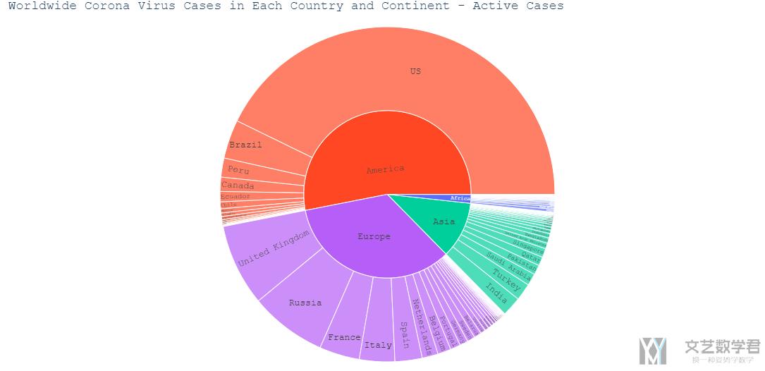
且这个图是可以进行交互的, 我们点击一个大洲, 可以看到其中国家详细的信息. 且鼠标放上去可以看到一个国家详细的信息, 例如我们点击欧洲, 鼠标放在挪威上, 可以看到对挪威active case的详细信息.
结合地图进行可视化
因为我们的数据与地图有关, 所以我们可以将数据与地图进行结合, 使其能够更加直观. 我们首先画出在5/11号这一天全球的active case的分布情况, 我们使用不同颜色代表不同的大洲, 圆圈的大小代表数量的多少.
- fig = px.scatter_geo(df_merged[df_merged['date']=='5/11/20'],
- locations = 'ISO3',
- size='Active', size_max = 55, color="continent")
- fig.update_layout(margin={"r":0,"t":50,"l":0,"b":0})
- fig.update_layout(title='Worldwide Corona Virus Cases Time Lapse - Active',
- font=dict(family="Courier New, monospace",size=13)
- )
- fig.show()
绘制的结果如下图所示, 可以看到美国现在active cases是很多的现在.
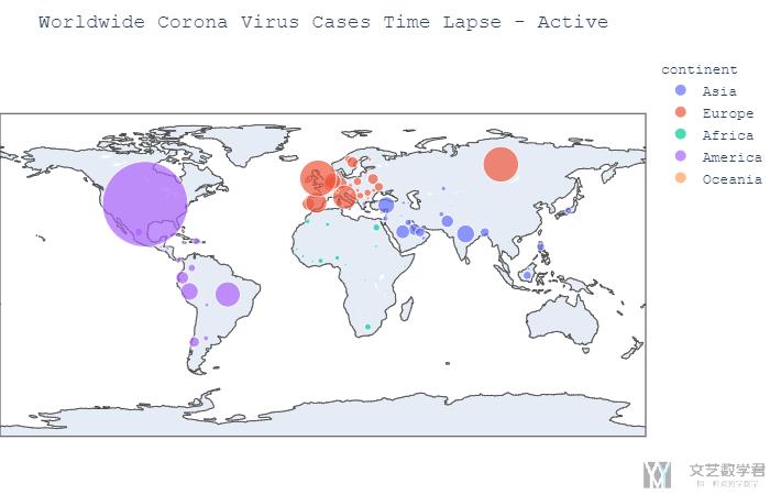
同样, 我们也可以将其制作为动态图, 显示每一天的变化. 代码基本是和上面一样的, 就是加上了animation_frame这个参数即可.
- fig = px.scatter_geo(df_merged,
- locations = 'ISO3',
- size='Active', size_max = 55,
- animation_frame="date", animation_group='Country/Region',color="continent")
- fig.update_layout(margin={"r":0,"t":50,"l":0,"b":0})
- fig.update_layout(title='Worldwide Corona Virus Cases Time Lapse - Active',
- font=dict(family="Courier New, monospace",size=13)
- )
- fig.show()
与其他数据集结合分析
上面只用到了Coronavirus的数据, 只是对其进行了简单的可视化, 从而帮助我们了解数据. 接下来, 我们要结合各个国家的GDP, Aging和Population进行分析.
直观分析
我们首先将aging和gdp的与confirm cases的图绘制出来.
- px.scatter(confirmCountry, x='GDP_2018', y='Aging_2018',
- color='continent', size=latest_date, size_max=60,
- hover_name="Country/Region", log_x=True)
结果如下所示, 其中x周表示gdp, y轴表示aging, 圆的大小表示每个国家的确诊的人数, 颜色表示所属的大洲.
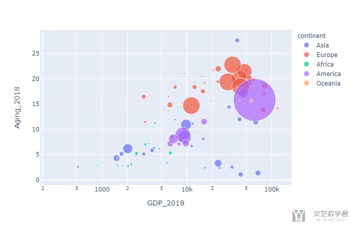
可以看到右上角的圆的大小比较大, 这个说明在GDP和Aging较大的国家, 确诊的人数也是比较高的. 这有可能是因为冠状病毒对年龄大的人感染力比较强, 同时GDP的国家交通比较便利, 所以传播起来是比较快的.
计算相关系数
首先我们计算一下相关系数, 我们计算变量GDP_2018, Pop_2018, Aging_2018, Confirmed, Death, Recovered, Active, deathRate, SickRate之间的相关系数矩阵.
首先将自己要计算的列进行合并, 方便自己之后计算相关系数.
- # Correlations for Dataset
- correlationM = df_merged[df_merged['date']==latest_date][['GDP_2018','Pop_2018','Aging_2018','Confirmed', 'Death', 'Recovered', 'Active', 'deathRate', 'SickRate']]
- correlationM.reset_index(drop=True, inplace=True)
- correlationM.head()
接着就直接将计算Pearson correlation coefficient和可视化的部分放在一起了.
- # 绘制相关系数矩阵
- plt.figure(figsize = (10,10))
- ax = sns.heatmap(correlationM.corr(), annot=True, fmt='.1f', cmap="BuPu") # fmt表示保留的小数点
- # 设置y轴的字体的大小
- plt.yticks(rotation=0) # 让y轴的字进行旋转
- # ax.yaxis.set_tick_params(labelsize=15)
- plt.title('Correlations for Dataset', fontsize='xx-large')
最后的结果如下所示:
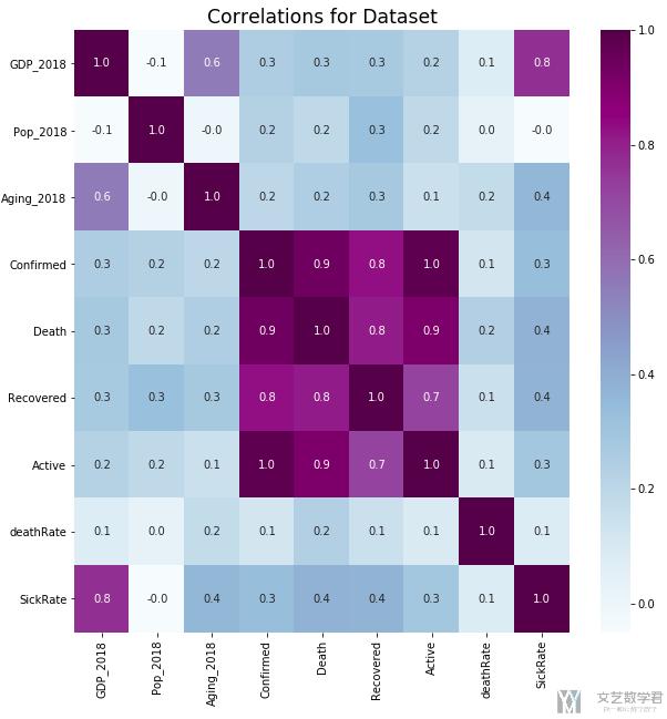
可以看到这里SickRate和GDP会有较大的关系, 我们单独画出他们的图(其实这里会有问题, 因为后面会使用log scale, 但是这里直接使用原始数据进行计算的)
简单的线性回归
上面我们从计算相关系数矩阵可以看到, SickRate和GDP之间的相关系数比较大, 于是我们画出这两个变量的散点图.
- px.scatter(df_merged[df_merged['date']==latest_date].dropna(subset=['deathRate','SickRate']),
- x='GDP_2018', y='SickRate',
- color='continent', size='Pop_2018', size_max=60,
- hover_name="Country/Region", log_x=True, log_y=True)
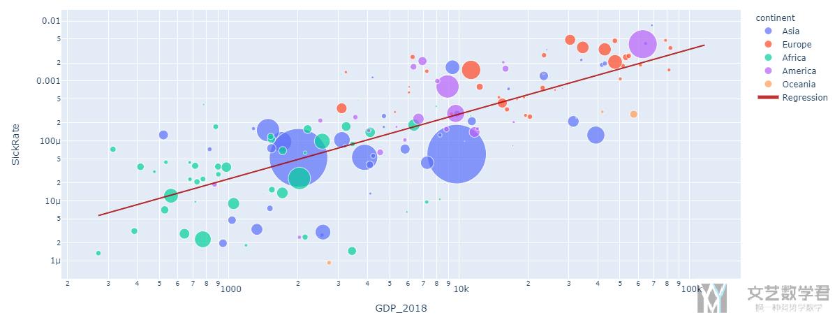
结果如下图所示, 可以很明显的看出有一个线性的关系.
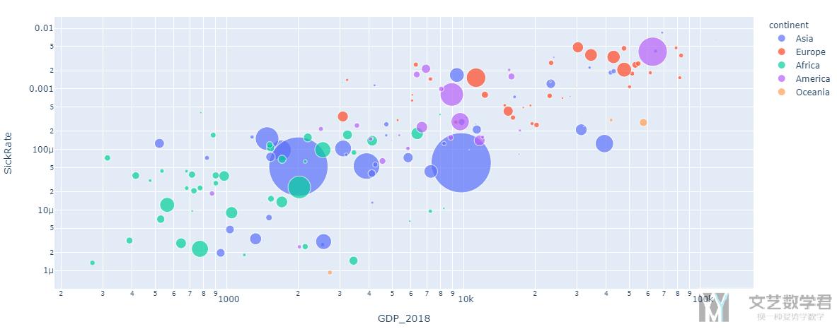
再上图中:
- Each circle represent one country.
- The x-axis represents the GDP
- The y-axis represents the SickRate
- The size of the circle represents the number of confirmed cases.
- The color represent the continent.
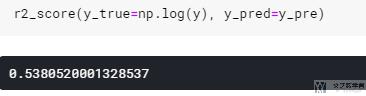
我们接着尝试使用线性回归, 来看一下线性回归最后得到的R^2是多少. 注意我们在这里进行线性回归的时候, 对变量都取了log, 之后画图的时候再求e^n, 这是因为我们在图中使用了log scale.
- x = df_merged[df_merged['date']==latest_date].dropna(subset=['deathRate','SickRate'])['GDP_2018'].values.reshape(-1,1)
- y = df_merged[df_merged['date']==latest_date].dropna(subset=['deathRate','SickRate'])['SickRate'].values
- weight = df_merged[df_merged['date']==latest_date].dropna(subset=['deathRate','SickRate'])['Pop_2018'].values
- reg = LinearRegression().fit(np.log(x), np.log(y))
- y_pre = reg.predict(np.log(x))
- # get prediction
- pred_dataframe = pd.DataFrame(x, columns=['x'])
- pred_dataframe['y_pred'] = np.e**y_pre
上面完成了拟合和预测, 这里没有训练集和测试集之分.
- r2_score(y_true=np.log(y), y_pred=y_pre)
最后的结果如下图所示, R^2=0.54, 可以用.
我们将散点图和拟合的直线画在一起.
- fig = go.Figure()
- fig = px.scatter(df_merged[df_merged['date']==latest_date].dropna(subset=['deathRate','SickRate']),
- x='GDP_2018', y='SickRate',
- color='continent', size='Pop_2018', size_max=60,
- hover_name="Country/Region", log_x=True, log_y=True)
- fig.add_trace(go.Scatter(x=pred_dataframe['x'],
- y=pred_dataframe['y_pred'],
- mode='lines',
- marker_color='rgba(152, 0, 0, .8)',
- name='Regression'))
- fig.update_layout(xaxis_type="log")
- fig.show()
从图上看还是有一个大体的趋势的.
其实在原文档里面还有一个对人数的预测的部分, 不过这个部分就是纯粹想让作业多一个部分, 没有什么意义, 所以就不在这里多讲了.
- 微信公众号
- 关注微信公众号
-

- QQ群
- 我们的QQ群号
-


评论